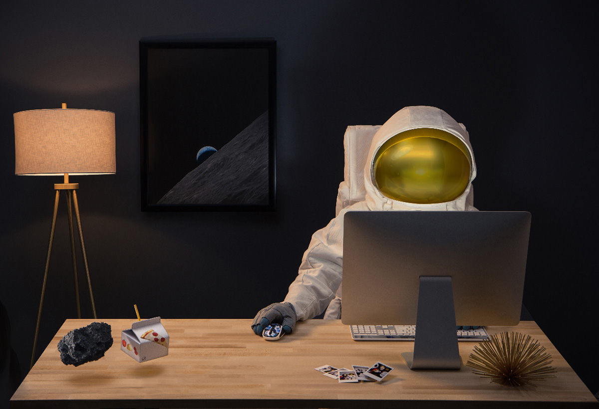
Each year, Logitech releases a limited edition batch of colorful, vibrant mice designed to break the mold of the stereotypical black or white computer peripheral. Our work on the previous collection was so well-received, the brand team invited us to Lausanne, Switzerland for a workshop that would set the design direction for the next series.
Wait, we get to help DESIGN the product, from the ground up?
We couldn't pack our bags fast enough. And by “bags,” we meant an extensive survey of emerging trends, covering everything from retro illustration styles to geometric patterns, '80s Memphis design, pastels and neons that were causing a scene, new botanical looks, folk art and even a category we dubbed “Punk Space Mermaid.”
Then I went to Switzerland with a suitcase full of design ideas.
All your favorite things
We recommended a mash-up of a few different styles. A well-curated combination of Pop-art meets Memphis design meets '90s retro illustration and patterns of things. The entire team was in, everyone from brand, sales, CMF, engineering, project management and a few folks with a “C” at the beginning of their title.
Then we might have gotten a little ahead of ourselves and offered up some unsolicited, and arguably totally freaking rad, pattern designs:
No, they didn't use our designs.
Our fingers were crossed, but we weren’t holding our breath. The Logitech CMF team split between Lausanne and China owned the product design, and after a couple months of revisions, the final line-up looked a little something like this (sadly, no tighty whities present):
Something else happened in Switzerland. As we were brainstorming, debating, discussing and exploring the design direction, we were naturally also talking about the product story. As the aesthetic started to come into focus, so too did the intent behind the new limited-edition series.
It was a perfect example of how story and design work best when they work together from the very beginning.
At its heart, the collection was a mashup of all “your” favorite things. It was an anything-goes combination of styles and subject matter that felt carefree, optimistic, imaginative and above all else: inclusive. If we had to sum up the design language, I guess we’d say…
All hands on deck.
In the spirit of the campaign's open invitation, we created a library of character hand images and unexpected lifestyle shots for the client's in-house digital team to use on Logitech.com. Yes, the cat was a real cat. No, the panda wasn't, although he did take his coffee with cream.
Art Direction - Brenna Vaughan & Sudon Choe
Copywriting & Creative Direction - Terry Stewart


